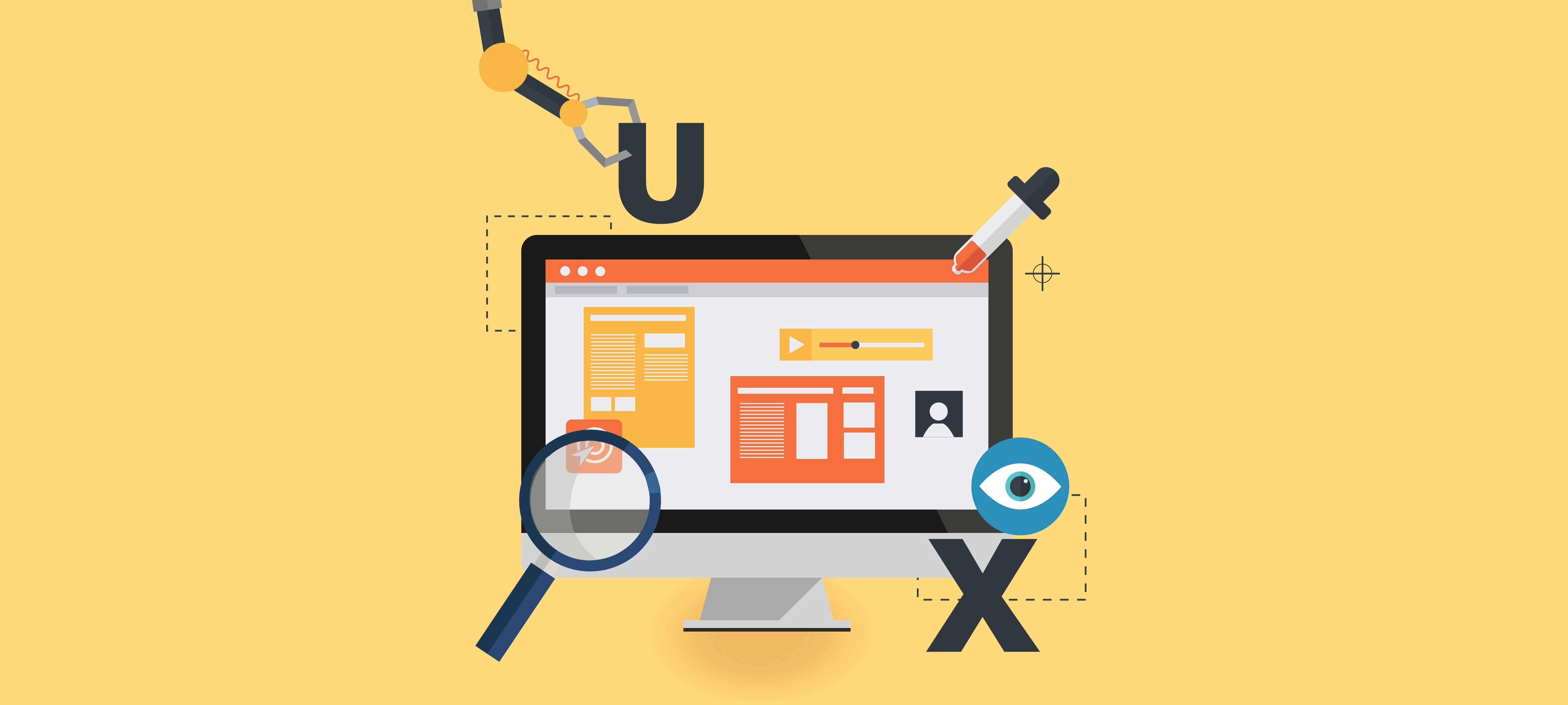
I’m passionate about digital design that focuses on people and their experiences, and I thought I’d share with you a few helpful aspects to consider…
User experience is a vital aspect for web development and has a huge part to play in why people use and continue to use good websites.
Some organisations don’t see the value in user experience – but why wouldn’t you want to ensure your target audience has the very best experience when you entice them onto your website.
Use motion to convey meaning
Think about how you can use motion and movement within your digital platform to convey meaning to the end user.
If you want a user to scroll down to explore the website or page you can include an animated scroll down buttons that help the user understand the action they need to take - like what we have on our website (see the image below). These can be especially helpful for people when the header is full screen to encourage them to scroll to see more content.
Links to other content presented in call out boxes can be used in a similar way. For instance an image within a call out box can be zoomed into which when hovered over, indicating that if people click on the box they will ‘zoom into’ that page.

Be compassionate and save people’s time
Design to safeguard your audiences time. Bear in mind that things that annoy you as a web user will also upset your customers – if you have disruptive pop ups, long forms or a complicated navigation system, act now to make changes so your user journey is as smooth and swift as possible.
Consider the purpose of your website. Is your overall purpose hidden within your all-too-clever website? Don’t forget if you want people to leave their data, purchase or indeed find out more about your key services – make it as easy as humanly possible for them to do so.
Provide users with multiple opportunities to do what they’re here to do quickly. Try to condense forms so they aren't as long. Use cookies to remember information to save people time on future visits so they don’t have to re-enter their passwords or information. Give prominence to goals that users will want to achieve on your website for quick access like checking out or calling you.
Make actions obvious and give visual feedback
Will users know where you expect them to click or interact? Is your navigation clear? Don’t disregard simple functions, they all have an important part to play.
Use clear and easily understood colours to convey meaning - for instance green can represent the success of an action.
When it comes to buttons make sure they look like buttons and that the placement and wording of them is obvious to improve the overall customer journey. Encourage users to take action with visual feedback, such as changing the colour of button or link to show it’s clickable.
You can provide visual feedback by directing people to success pages and using animated elements to let the user know that their action was successful and to let them know what will happen next. Loaders or progress indicators/bars should also be used in areas that take time to populate so people understand their action worked and that the site is doing something.
Make exploration robust and clear but keep it simple to understand
Ensure it’s easy for users to explore should they wish to look around your website. One example is encouraging people to visit subpages that aren’t available on the main navigation menu – feature them elsewhere in a prominent location to provide as many ways as possible to travel (simply) through your platform.
On long scrolling pages, use a ticker on the side to help the user know which section of the page they're at, and how much is left to explore.
Make use of space within menus. Large full screen menus can be used to great advantage with imagery or descriptions to give clearer context of the destination to encourage users to keep moving around the site and so they can more easily find what they’re looking for.
Depending on the content of the page you may want to include additional information or browsing options towards the end like in the below example. Foot the page with a degrading hierarchy of destinations such as a strong call to action, other related articles, view full blog, the footer menu, or social media icons. That way if the user says ‘no’ to the first call-to-action, they have the next, broader call-to-action to consider.
Polish the interface to avoid pain points
Broken controls or links are a real no-no. Test, test and test again to ensure you website works well before your launch.
Take care to iron out any visual bugs, clean interfaces go a long way to building trust in your users. Common mistakes can include text being too cramped on the page or long lines of text which aren’t easy for a user to digest so don't be afraid to redesign a section if there is a better way to execute it. Always keep the structure consistent and remove any anomalies / random edge cases to help avoid any visual confusion so the design remains uniform across different pages.
In summary, don’t discount user experience when it comes to web development – pause for a second and consider if your website is the best that it can be. If you find it frustrating to use – don’t just launch regardless due to other pressures. Hold strong and make a stand for great user experience.
Take a gander at some of my favourite websites below when it comes to UX:
- https://webflow.com/ecommerce
This website has great use of motion to clarify the creation process they offer. - https://deliveroo.co.uk/
Offers an incredibly smooth journey to purchase, taking only three clicks (with no information needing to be re-entered if you're logged in). Plus it has an effective food selection process and delivery status page. - https://paper.dropbox.com/
Really simple and great document editing that's flexible, full of rich features and presented in an incredibly clean, digestible way that keeps you focused on creating and not on formatting (https://medium.com/ is great for this too).