Whether you notice it or not, typography is part of your everyday life.
There was a time (probably before computers) when typography was an artform. Fonts were lovingly crafted in foundries and kerning (the space between individual characters) was tweaked to perfection.
In the early 80s desktop publishing exploded and everyone was suddenly a ‘do-it-yourself’ designer. People could create their own logos, posters and presentations and they became familiar with the batch of fonts provided as a package on their computers. Inexplicably people seemed to love Comic Sans and Times New Roman.
Somewhere along the way a certain finesse was lost. The profession of ‘typesetter’ disappeared within a matter of years. At best a lot of typography became purely functional, at worst it was ugly and illegible.
Part of our job as graphic designers is to bring the professionalism back to typography - whether it’s a dominant part of your logo or the body copy in your company brochure. This means that whenever we start a new brand, while colours, shapes and illustration may all play their part – one of the biggest decisions we make is what font to use and, critically, how we use it.
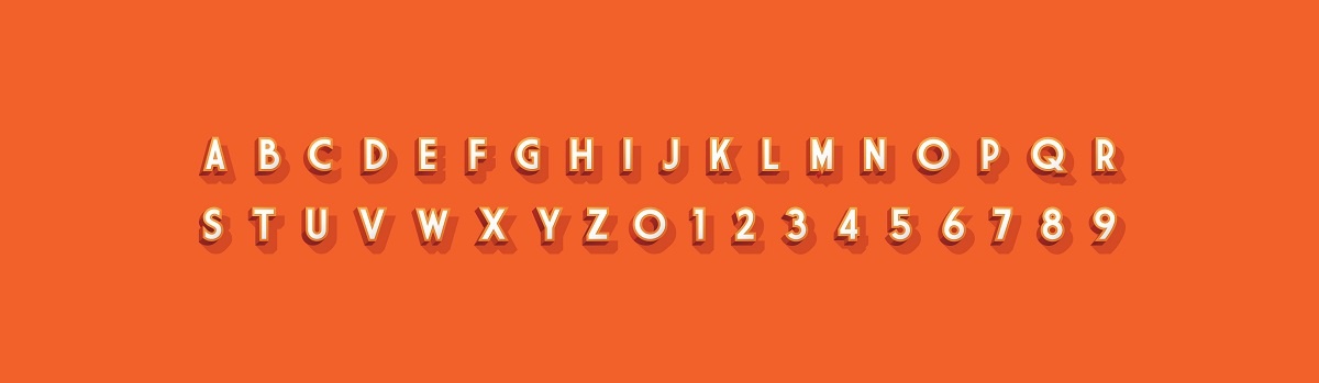
The selected font will express a great deal about your brand’s personality. A serif font (which are presently enjoying a revival in popularity) can convey tradition and gravitas but equally, if used the right way, can turn everything on its head and say the exact opposite. A san serif font can create a minimalistic contemporary effect.
Use of all caps, all lower case, a mix of the two – all decisions to be made that help to say who you are and how you want your brand to be positioned in the future.
From a practical point of view, we can ensure that good typography makes your message more readable and understandable. Leading - which is the vertical space between lines of text - plays a vital role in readability. Make it too tight, the text becomes too dense and no one will want to read your brochure or literature.
Keeping things simple, avoiding the use of too many fonts and too many text sizes, letting white space speak for itself can all help to make a page of text more inviting to the reader and this is often what we recommend to our clients.
While computers may have been responsible for the initial fall in standards, they’ve also played a positive part over the years. We now have a broader selection of fonts available to us at far more affordable prices than we could ever have hoped to access before. We can try different point sizes – by half point increments – at the touch of a button until we gain design perfection. We can give you, the client, far more choice and creativity.
The devil is in the detail of course, but the use of good quality, considered, professional typography really can make a huge difference to how your brand is perceived and how effectively your message is delivered to your customers.
To discuss your next branding project with our creative design team, call us on 0191 499 8415 today.